More Than a Buzzword
Responsive design is a buzzword you may have heard. If you have brushed it off as just so much jargon, you need to take a second look. Responsive website design matters when it comes to helping your business grow. It will make a difference in your user’s experience and in how your site ranks in search.
Case in point: Have you ever been annoyed or frustrated by how slowly a website loaded on your smartphone or by how the page doesn’t properly fit the screen? Did you give up? Did you move on to another site that popped up quickly or “responded” to your screen size?
That’s what your customers may be doing if your website doesn’t take a user’s experience into account. When a user moves on to another site it essentially means a lost customer for you. That’s called bounce in our business. It’s not the bounce you want. Responsive design can help you reduce your bounce rate.
The Shapes of Things to Come
If you remember TVs before the age of flat screens, you know how movies were reformatted to fit the screen. Pan-and-scan left a lot out of the film. Then broadcasters went to letterbox style, which created blank strips above and below the image. Ugh! Finally the industry changed the TV screen to the same ratio as theater screens. Problem solved!
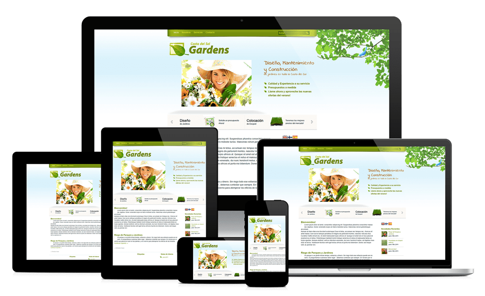
But how do you reformat your website to fit smart phones, tablets and your laptop? These devices aren’t going to use the same screen proportions any time soon. And what will you do as new devices come onto the market? Smart watches. Smart glasses. Smart clothing. What’s next?
What you need is a shape-shifting web design. Lucky for you shape-shifting design already exists. It’s called responsive design.
The Best of All Worlds
Responsive design most simply put means a design that can be optimized for a wide range of devices. You could create a mobile-specific site, but the extra effort to build the coding into your original website is worth it. Users expect a similar experience regardless of the device they use to access your site. Responsive design ensures that consistency.
Days of Future Past
Another benefit of responsive design is what web designers call “future-proofing” your site. We all know how quickly technology evolves. A decade is long enough for the newest advance to become relegated with the dinosaurs of extinction. Responsive design gives you a shot at extending the life of your website.
While we aren’t ready to ditch our desktop or laptop computers yet, consider your own use of all the devices you own: traditional pc, tablet and smartphone. All the trends say we use our smartphones more than any other device.
- How much time do you spend on your smartphone actually using it as a phone?
- How much time do you spend texting on your smartphone?
- How much time do you spend browsing the internet; specifically, searching for products or services?
We use smartphones to get directions, to find nearby coffee shops or restaurants, to find the best prices, to purchase stuff, to take photos, and to share stuff on social media.
Sounds like you really need to make sure that your website easily translates to mobile usage. That’s why responsive website design matters.
World One: Traditional PC
The first web designs weren’t very good by today’s standards. Most pages were large blocks of text like a page out of a book. You had to scroll endlessly to find the information you needed at the bottom of a page that was too long for the screen.
In the newspaper industry, that’s burying a story on the back page rather than placing it above the fold on the front page. These days, who lingers over anything? We want information and we want it now! Good web design helps readers navigate the site to get what they want quickly.
Lesson learned: Webpages aren’t the same as book pages.
Web designers began designing for the new medium of the Internet. Computer screens are horizontal or landscape in orientation compared to a book page, which is usually vertical or portrait in orientation. One isn’t better than the other, but a good designer takes advantage of the orientation.
Lesson unlearned: Web designers improved the look and navigation of websites. Maybe they learned that lesson too well. As new devices came on the market, designers still designed for the pc. Back to square one.
World Two: Tablets
Laptops helped us cut the cord and made our computers portable. Tablets became the next step in evolution. Smaller. Lighter. Just as powerful. Another advantage was the ability to switch the orientation from landscape to portrait and back again. We love how a tablet automatically adjusts what we see on the screen without losing anything.
Lesson re-learned: Tablets aren’t the same as laptops or desktops. Web designers started taking that into account.
World Three: Smartphones
Think of smartphones as tiny tablets on steroids. Do you know anyone who has one who goes anywhere without it? We didn’t think so.
You absolutely need to capture your customers no matter which device they are using. Increasingly, that device is a smartphone. A smartphone is not a pc.
Don’t Get Lost in Translation
The upshot is that responsive web design matters. Your beautiful website functions perfectly on a traditional pc. However, it gets lost in translation to other devices. You need to remedy that situation.
If it matters to users (potential customers)…
And believe us, it does! We know you believe in providing the best customer service in your brick-and-mortar store. Your website also needs to provide that same customer service.
Here’s what we know about the online user/customer experience:
- What’s readable on a 27-inch desktop screen is unintelligible on the largest smartphone screen if you simply try to shrink it.
- Responsive design prioritizes your website content and optimizes it for smaller screens.
Why frustrate your customers with fine print? Do you know anyone who reads that?
- A website that loads quickly on a 27-inch desktop is sluggish on a tablet.
- Responsive design prioritizes your website content and optimizes how quickly it loads on other devices.
Why frustrate tablet or smartphone users with an endless wait for your site to appear?
Would you have the patience? Don’t put your potential customers on hold!
- Your website is comprehensive yet simple to navigate on a 27-inch screen. It’s too much information on a smartphone screen.
- Responsive design provides a familiar look and layout but in a smarter, sleeker format for the device.
It matters to you
When you take care of your online customers by providing the best user experience, you will improve your bottom line, regardless of the device they use. Responsive website design matters to your customers, but it matters to you too. Here are just a few of the reasons:
- Google ranks mobile responsive sites higher. Don’t sabotage your business by being “unresponsive.”
- Responsive design reduces your bounce rate. Stick the landing! Don’t let your customers bounce to another site.
- The consistency you gain with one URL that’s compatible on all devices increases customer loyalty. Those loyal customers on smartphones share stuff on social media! It could be your website!
Seamless Translation
Here at Solutio we are ready to provide expert responsive website design. Think of us as your personal translator as you move from the online pc world to marketing your business for tablet and smartphone users. We’ll write the code behind the screen so your business will speak fluently to your customers.
The time to make the leap into responsive design is now. Your customers are already using other devices to search and shop online. Solutio will ensure that your customers experience the same flawless navigation regardless of device.
Responsive website design truly matters. When Solutio incorporates responsive design into your website from the outset, one URL will do it all for your business.
So check Solutio out—on your pc, your tablet and your smartphone. Then contact us. We’ll do the same for you!
Links:
https://info.thespotonagency.com/why-responsive-design-matters
https://www.engadget.com/2016/11/17/why-responsive-web-design-matters-more-than-ever/