What is “responsive” design and what does it do?
Have you ever tried connecting to a website with your smartphone or tablet only to find a jumbled up mess? You couldn’t make heads or tails of the content it was trying to provide, so you closed out of the site. Then, when you try viewing the same website on your desktop computer, the site made perfect sense! Why does this happen? How can this be prevented?
Welcome to the Mobile World!
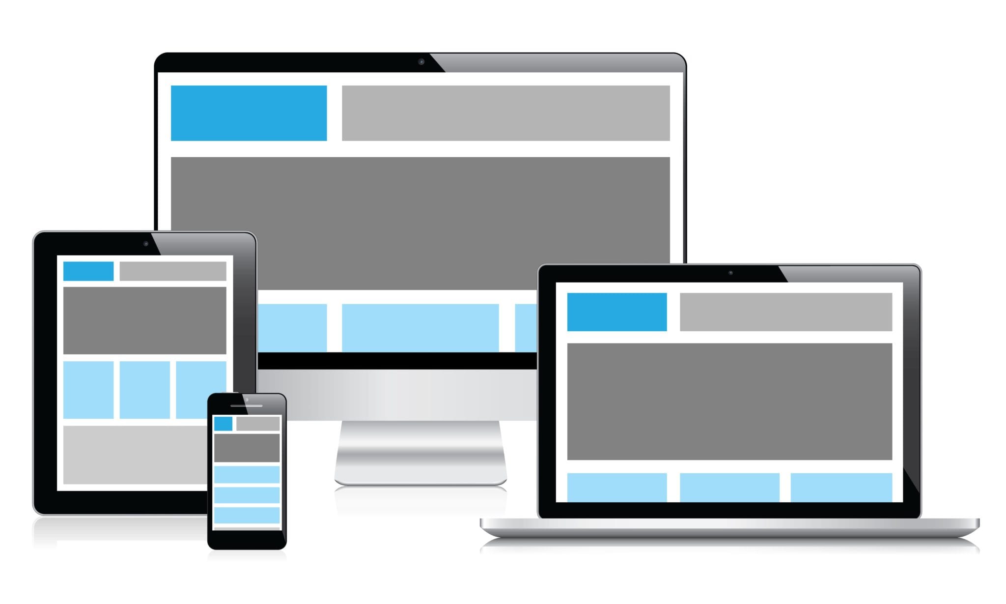
There are so many devices today that connect to the internet. People are logging in with mobile devices, tablets, netbooks, laptops and desktop computers. And just think about the range of different sized screens! The pressure is great in this day and age to create websites that will work well and look fantastic no matter what device it’s being viewed on.
The Old School Way
Previously, most websites were developed using a fixed layouts. These had a common screen width of 1024px that was deemed to be a safe size for websites. But, this doesn’t work very well on mobile screens and the site can look lost on the larger screen of a desktop. The old technique for dealing with this issue was to create two different properties. One property was optimized for mobile use and the other for desktop. This led to another issue, now there are two websites to maintain which increases the cost of development and maintenance. And what about the devices that now sit between a mobile and desktop like an iPad?
Welcome, Responsive Design!
Now is when responsive design enters the game. This is an approach that web designers and developers now take that adapts the layout of the site and allows small and large screen devices to share the same code base and content. There is no longer the need to develop and maintain two separate websites! When using responsive design, you only need to develop one codebase for all of your users. It doesn’t matter what device they are using!
How do they do that?
There are a number of techniques that designers and developers alike incorporate when implementing responsive design:
- A fluid layout that allows the page elements to grow or shrink to accommodate a width range where the browser can adjust the layout.
- Media requests allow you to determine which style to use when a desired width has been reached or detected.
- Viewport tells the mobile browser when a site has been optimized for mobile viewing and condenses the page at the devices width or height.
When these elements combine, it makes it possible to deliver an optimized experience for the user no matter what device is being used.
Responsive Design is Here to Stay!
When a web designer or developer uses the responsive design approach, web pages are created using flexible layouts, flexible images and cascading style sheet media queries. The end result is a website that is acknowledged by the browser of whatever device you are using. Then, the website is optimized for the devices screen size and page layout creating great pleasure for your mobile viewing!